Project List
Leave a commentThe Death of the Author Roland Barthes
Consider this Barthes essay from the viewpoint of the artist and not a writer. What is Barthes saying about the author, or about ownership? Considering his stance on authorship, what is the role of the reader (or viewer) in the consumption of a work of art? Do you feel this is empowers the artist or is it the opposite? Be prepared to discuss the role of society at large in the production of a work of art from Barthes’ point of view. Write a 300 word response to the Barthes essay.
Click Here for the Text by Barthes
Studio Journal
The journal or sketchbook will function as a compendium of several important aspects of the course.
It should be used to
1. take notes on technical lessons during class,
2. record conceptual ideas from project planning and class discussions, and
3. record feedback received in critiques.
Each project should be sketched out, analyzed, and evaluated upon completion through extensive notes and small sketches. After the first project, a project may be developed through 6 -10 small studies done in the journal along with notes about conceptual goals and methods for production. This self analytical writing will facilitate a more thoughtful and well-crafted project in the short term and over the semester promote a self-awareness of challenges and successes in working method.
Project 6: Color and….
Materials:
Open to interpretation
For your next project you will combine color and one of the three projects we did in black and white (Line, Space, or Value.). You’ll focus on enhancing the principles of of the black and white project by using color. This can be a redesign of your previous black and white design or can be a new and improved design.
Sketches:
For the sketches you will redo the sketches from the black and white project but include an exploratory sketch involving color. These sketches can be completed in any media, this includes digital media. Consider how you might solve problems in the sketches and avoid them in your final draft. These sketches will follow the 4″ x 5″ format and need to be mounted on a sheet of 14″ x 17″ sheet of Bristol.
Final Design:
On a 14″ x 17″ sheet of Bristol you will complete your final design. Make sure that you are prepared to discuss your color decisions impact the success of the other formal elements in the design. For example, you may talk about the use of complimentary color or contrast to create the illusion of space. Your project should be larger than 8″ x 10″, there is no restriction on what the proportions you use. Also regarding media you can use any traditional non-digital media for the final design.
Grade Report
| Craftsmanship15 | |
| Composition 20 | |
| Successful Fusion of 2 Units 20 | |
| Following Directions 10 | |
| Cohesive Formal/Conceptual Idea 10 | |
| Clear Understanding of Project Goals 5 | |
| Professionalism and Presentation 10 | |
| Sketches 10 | |
| Total Points of 100 |
Project 5: Value
MATERIALS:
Hole Punch (a single hand held punch, don’t get a 3 hole punch)
5 copies of a given Grayscale chart.
Black Pens 1 Fine Point Sharpie + 1 two-sided (Fine/Broad) Prisma Color Marker
Exacto Knife or tweezers (for placing the hole punches)
Graphite Pencils Pack of 4 Graphic or Soft Sketching Pencils (HB, 2B, 4B, 6B)
Design Ebony Drawing Pencils Pack of 2
Metal Ruler: 18” or 24”
T-square or triangle with 12” inking edge
Pad of Bristol Paper 14” x 17” pad
Variety of Erasers
INSTRUCTIONS:
This project comes in two parts, follow the specific directions below. This project will serve as an example of your ability to see, choose and interpret value in a variety of images.
Part 1
In 1A-1D, you are going to create 2 value studies of different images using a variety of grayscales and techniques in the hand outs I have given you. You will cut out and mount your studies on 1 sheet of Bristol. You must choose one grid study (1A or 1B) and one continuous tone study (1C or 1D)
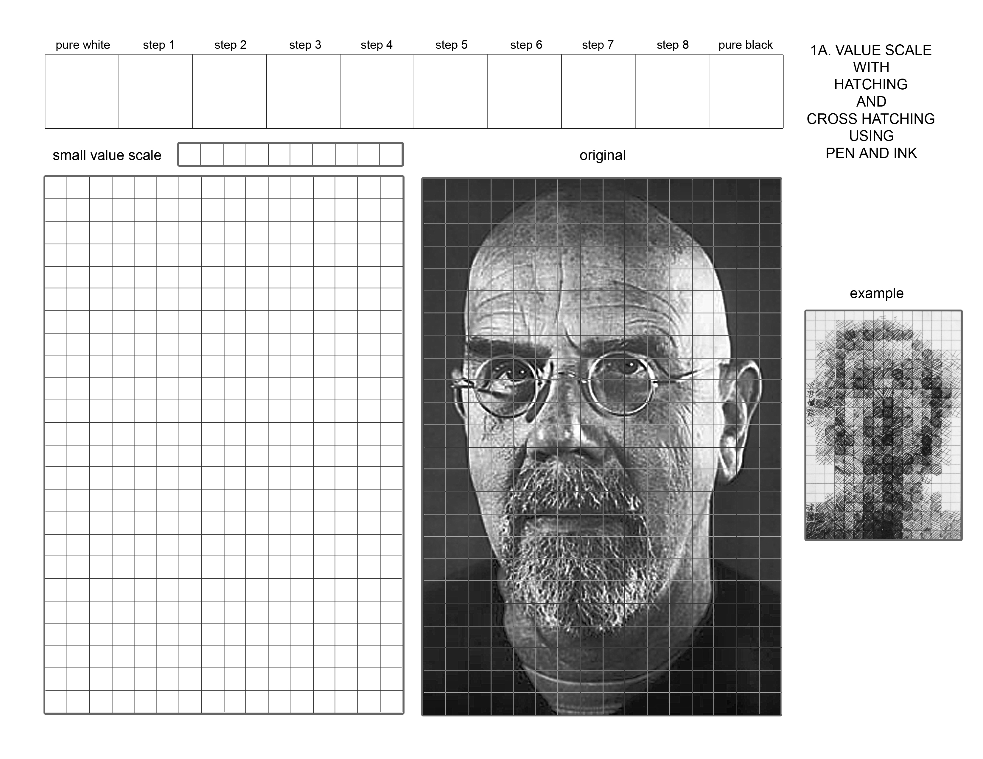
1A. Value Grid Hatching with pen and ink
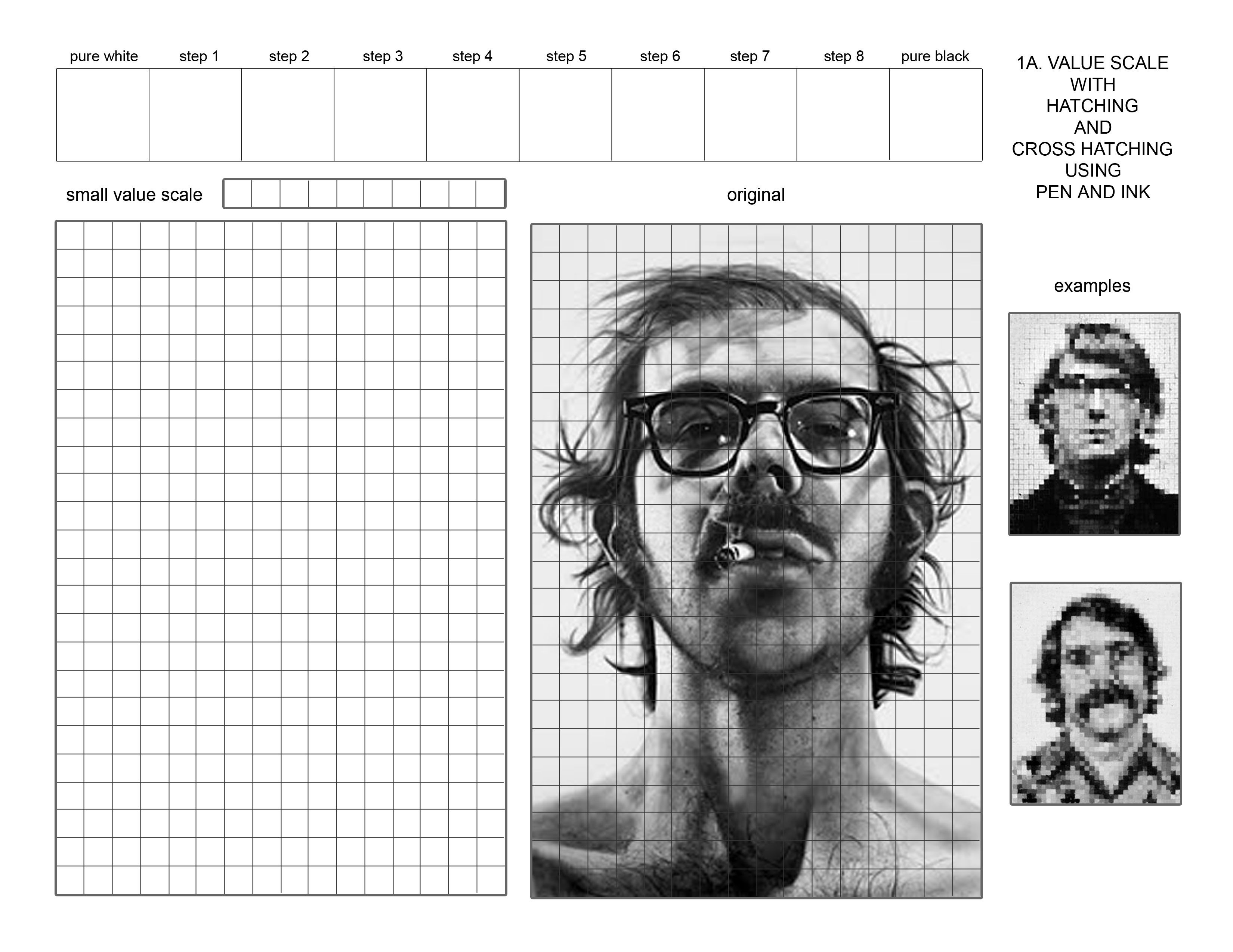
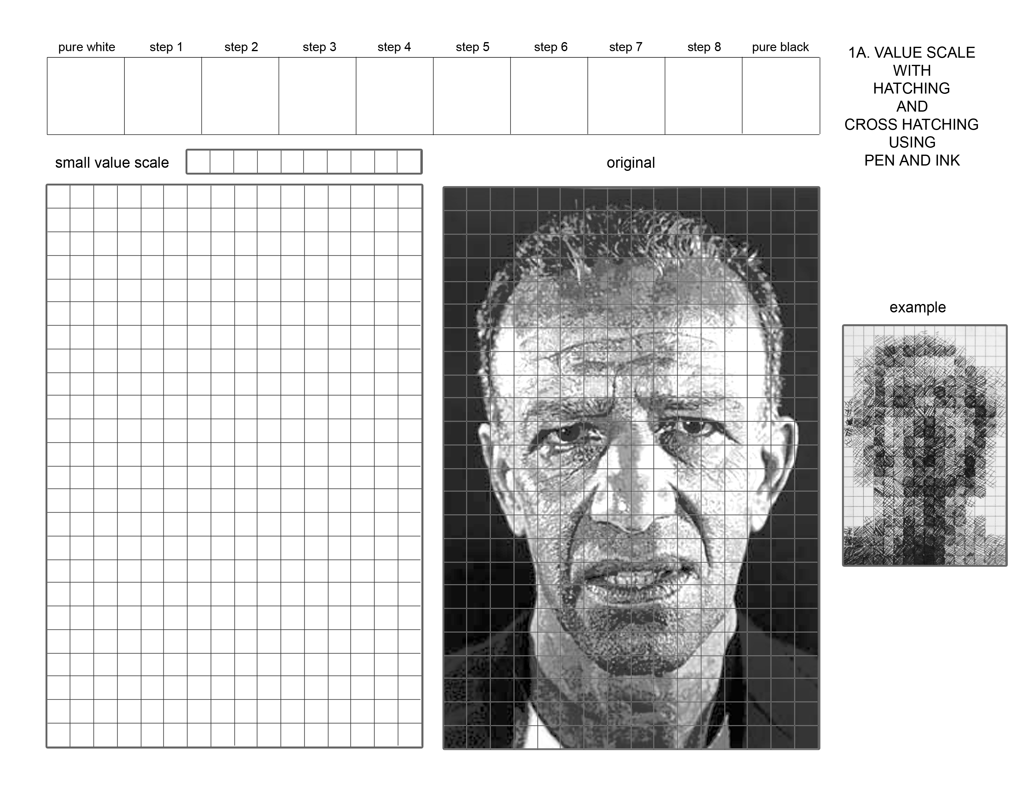
You will start by creating a grayscale with hatching or cross- hatching with a fine point pen at the top of the page. Try to make the transition between each step as smooth as possible as you go from white to black. You will then transfer a version of this grayscale to the small grayscale above the left image. Finally, you will go square by square on the left grid and you will choose from the value steps in the small grayscale trying to match the value of the squares in the image on the right. Try to make each block a single value like your grayscale. This will make it difficult to keep detail in your translation of the image.
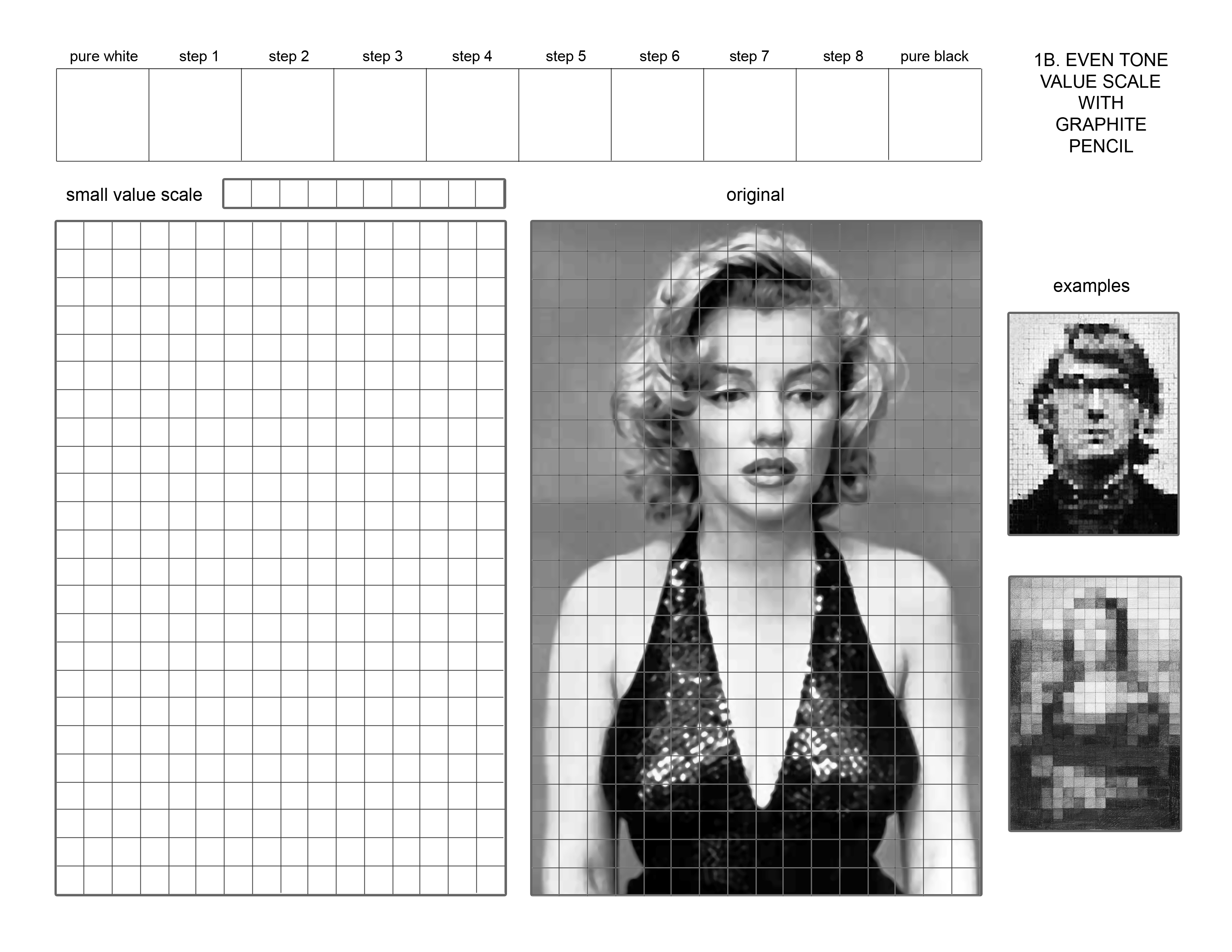
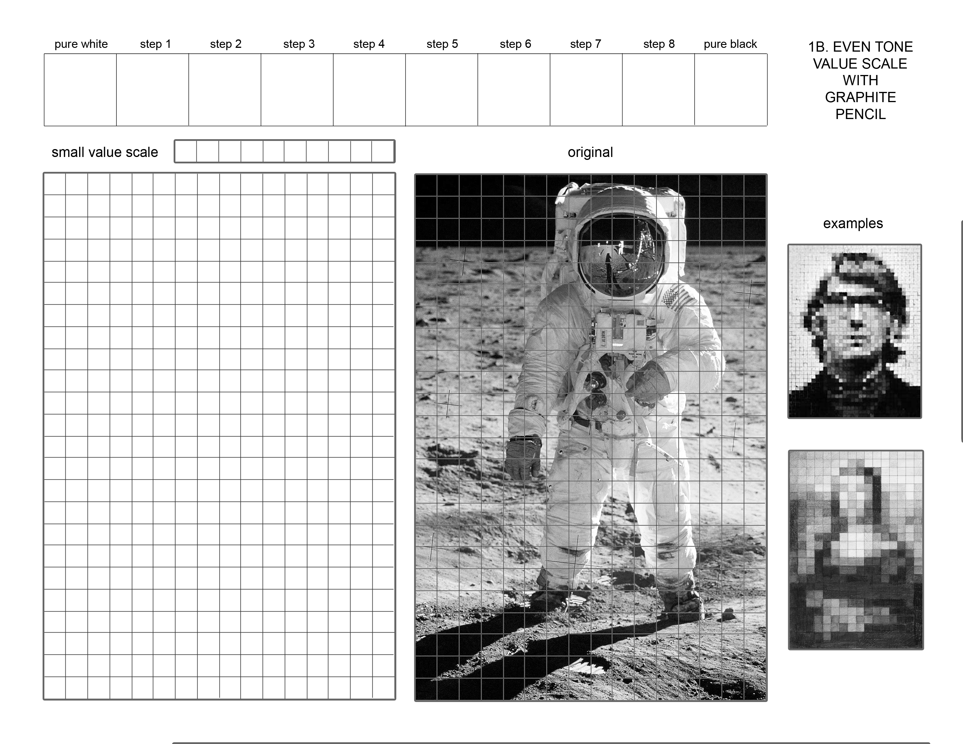
1B. Value Grid Even tone Graphite pencils (2H, B, 2B, 4B)
You will start by creating a grayscale with subtle even tones of graphite at the top of the page. Try to make the transition between each step as smooth as possible. You will then transfer a version of this grayscale to the small grayscale above the left image. Finally, you will go square by square on the left grid and you will choose from the value steps in the small grayscale trying to match the value of the squares in the image of the Mona Lisa on the right. Try to make each block a single value like your grayscale. This will make it difficult to keep detail in your translation of the image.
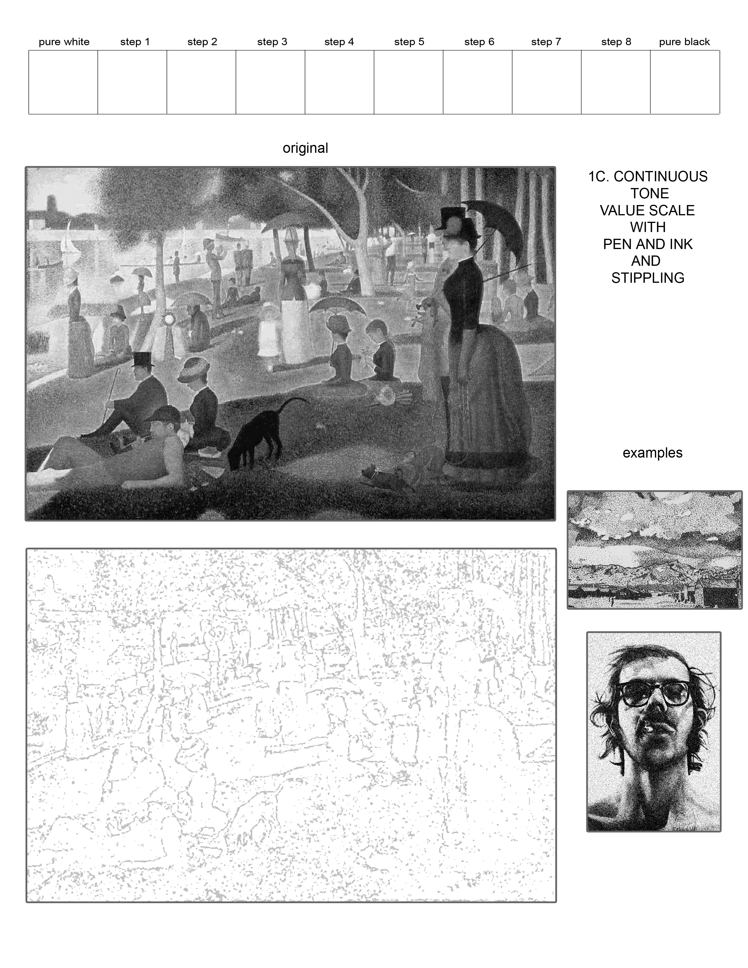
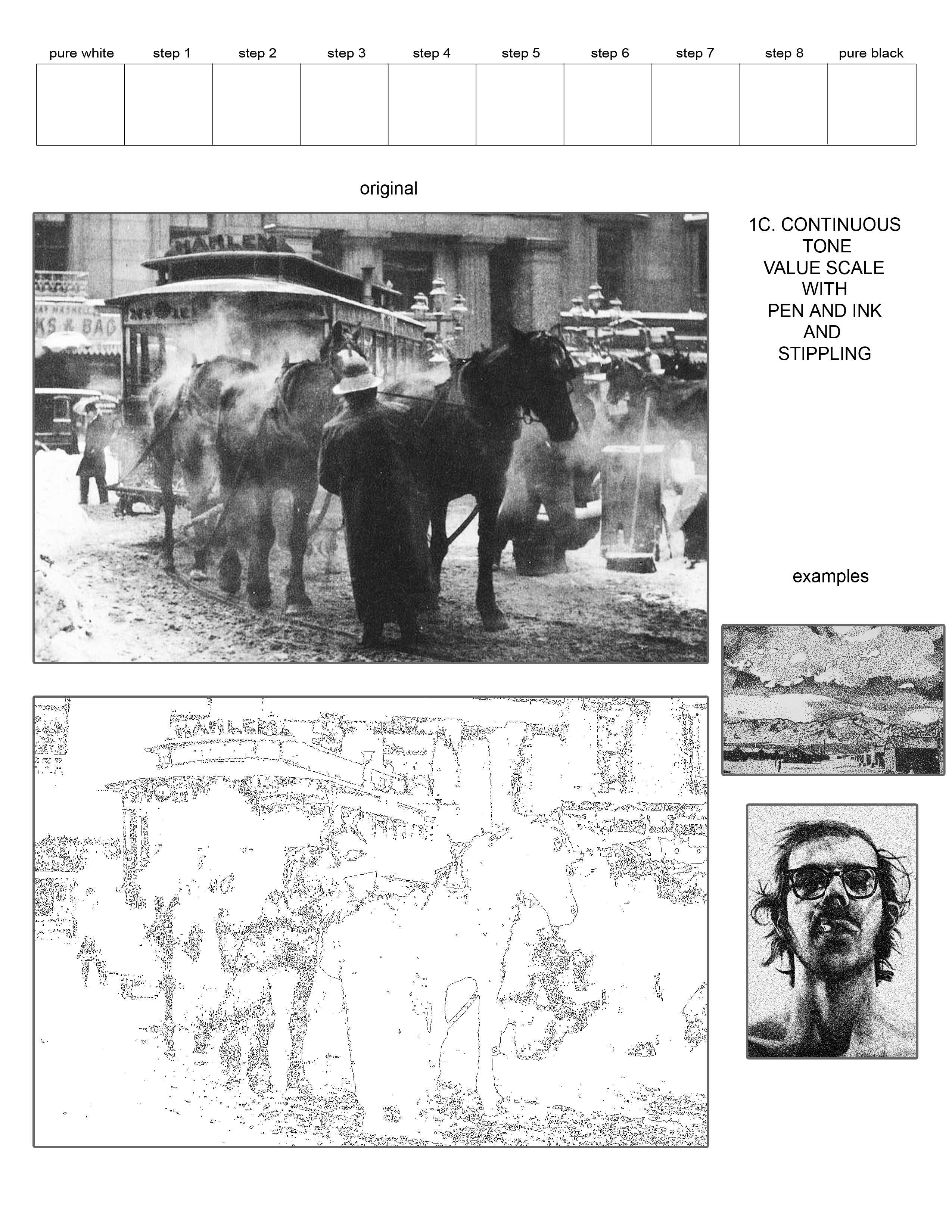
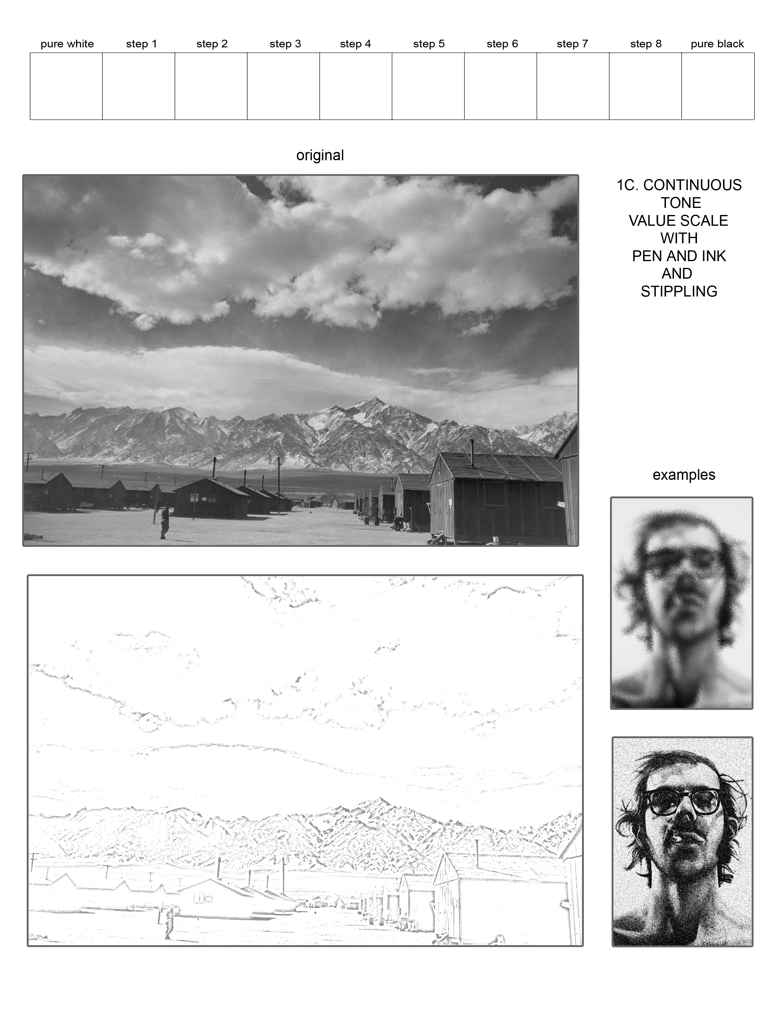
1C. Value image w/ Continuous Tone using Stippling with pen and ink
You will start by creating a grayscale with stippling with a fine point pen at the top of the page. Try to make the transition between each step as smooth as possible. Finally, you will translate the image of the landscape with randomized points of stippling where you let value accumulate by the amount of dots you put down. You are not required to work in the grid fashion, but remember your goal is to interpret the value more than the detail, and that it will be difficult to keep finite details in your stippling translation of the image.
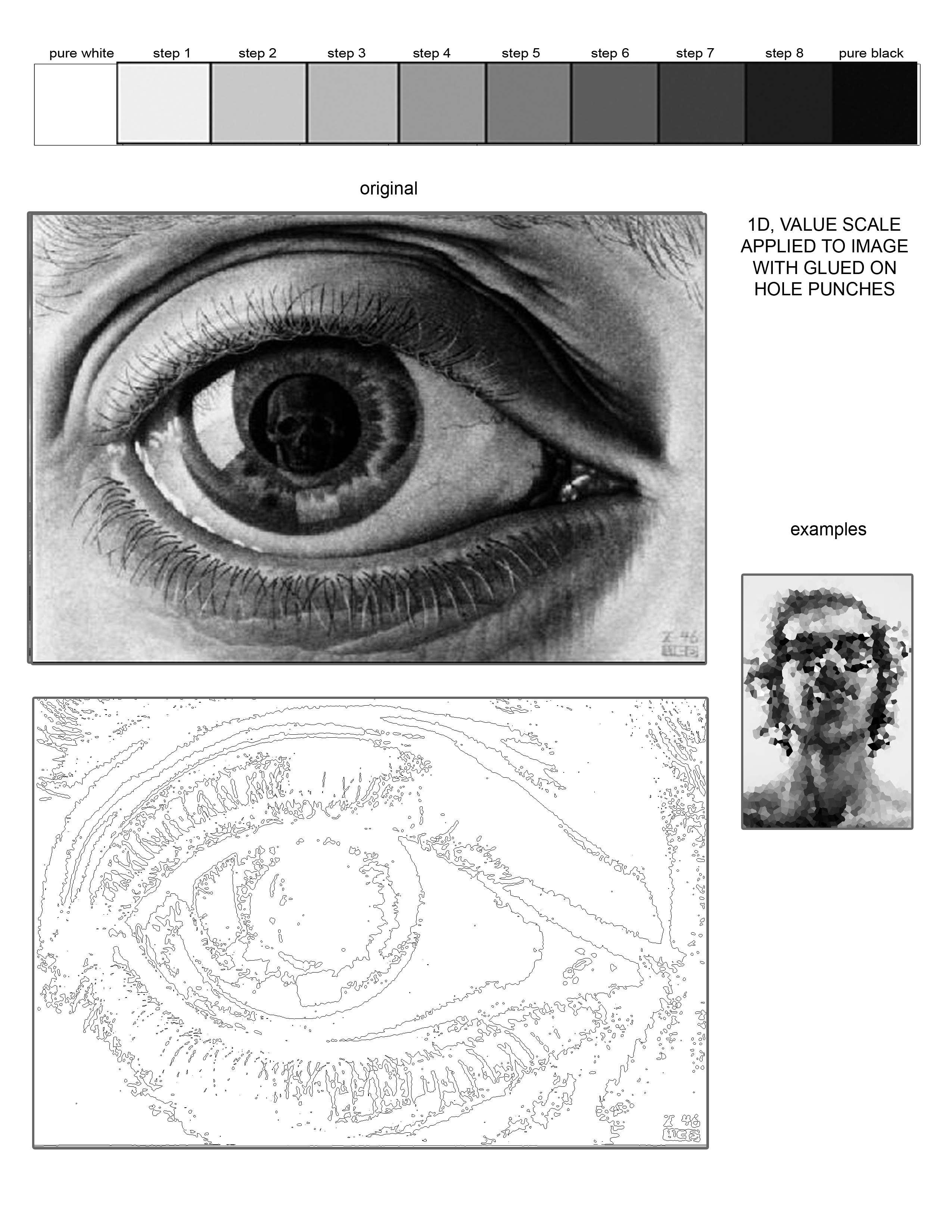
1D. Value image w/ glued on hole-punch taken from Xeroxed value scale
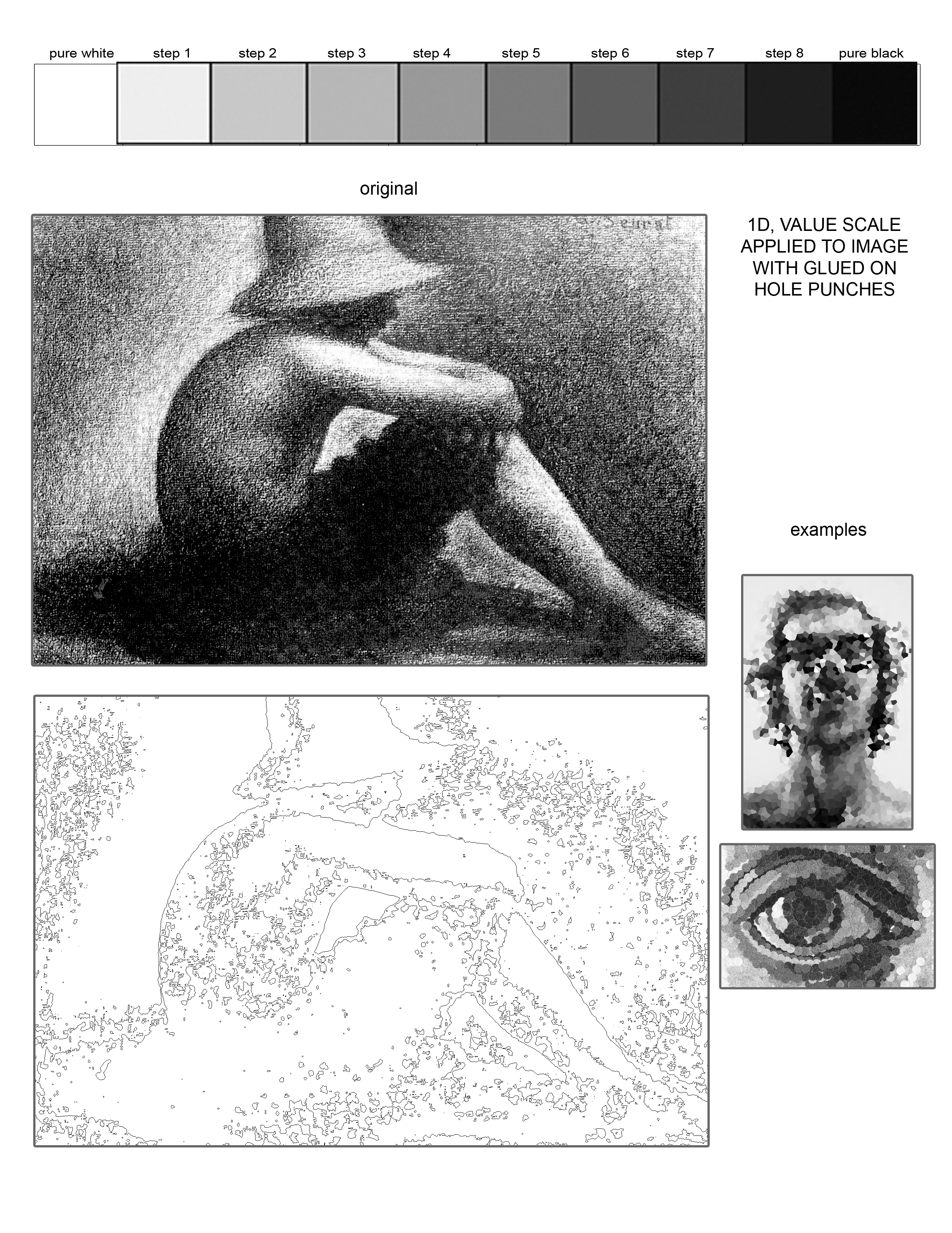
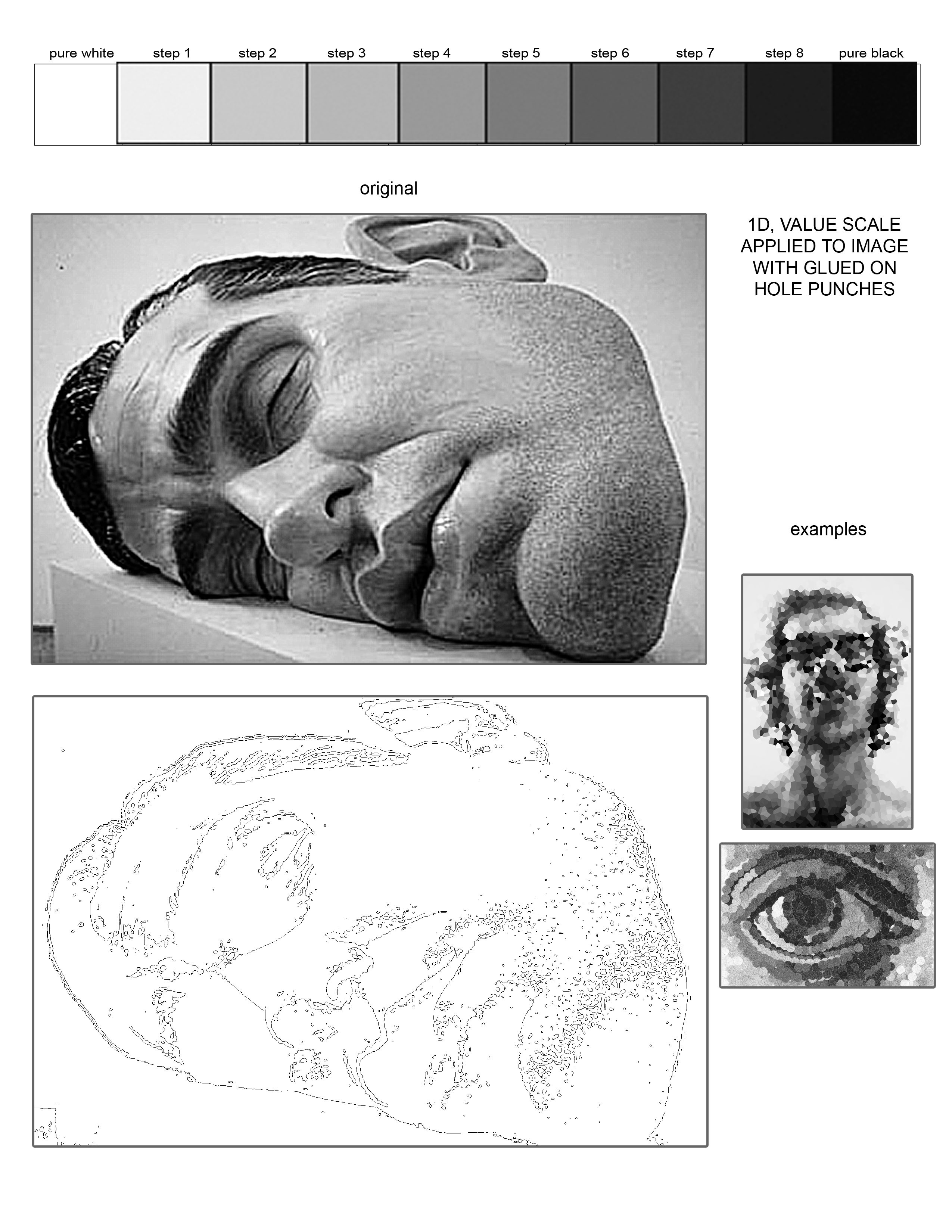
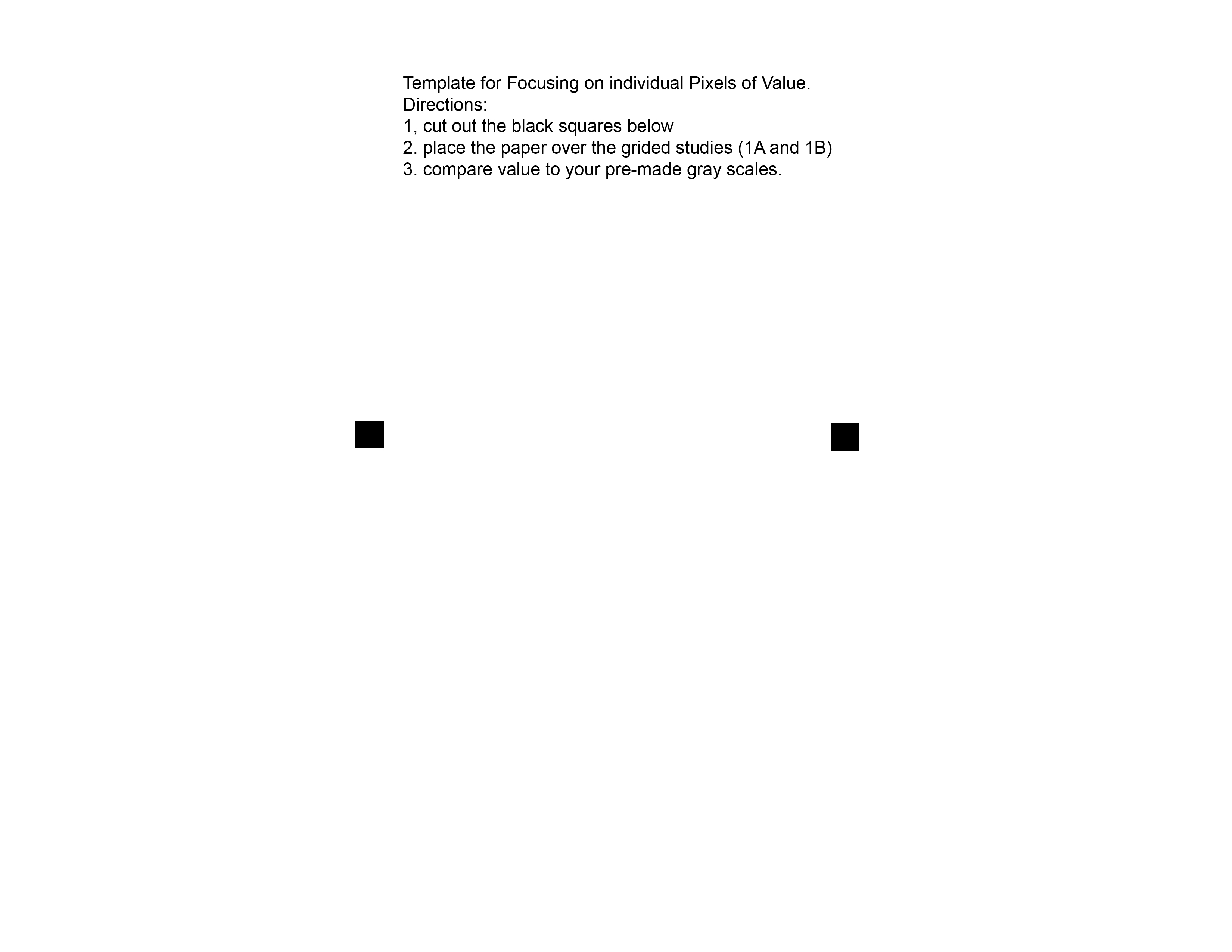
To start, you will be given a few grayscale charts with 11 steps of value. On this chart, the first step is white and the last step is black and there are 9 steps of gray variations in between. Looking at the range of value in the grayscale chart as compared to the image of the eye, you are going to try to interpret the image of the eye at the top into the 4×6 space on the bottom of the page by gluing in the different values of the hole-punches that you will punch out as you go. You are not required to work in the grid fashion and you can overlap the hole-punches to create clearer detail. But remember your goal is to interpret the value more than the detail, and that it will be difficult to keep hard edges and finite details in your hole punch translation of the image.
Part 2
First, after completing Part 1, I want you to choose and bring in at least 2 different B+W photographic images that contain a full range of value throughout the image. This photo needs to be taken by you or someone you know. IT CAN NOT JUST BE A DOWNLOADED IMAGE FROM GOOGLE. No commercial photography is allowed. It needs to be unmanipulated and not a photo of another piece of art. Don’t choose an image that has too much contrast with too much black and white or an image that is too flat with too much gray. Try to find an image with the full range between black, and white, including a wide range of grays. Next, you will make at least one photocopy for each of the 2 images, each copy should be at least an 8×10 section on an 8.5 x 11 piece of paper. (Sometimes copy machines are tricky and will under or over expose your image. Make as many copies as needed until you have copies that contain the full range of grayscale steps. Also, it is probably best to keep the original image, if possible, to use as your first and best reference.) Looking at your 2 images, I will help you choose the image that is your best example of a good value range, and then you will choose one of the first four methods you completed in the first part of the assignment. You will be creating an 8×10 value translation of the decided image with your choice of method. If you choose a grid method, your squares need to be .25 or ¼ inches big. Try and understand the range of value in your image and anticipate where different areas of value are going to fall (Think paint by number style). For the final step, you will grid or trace your image over to an 8×10 section of Bristol using very light pencil marks. Finally, you will start adding value with your chosen method and materials. Remember, you are trying your best to interpret the value in your copy onto the Bristol Paper. Try to meticulously mimic the value using the different gradations and the range of grays you are capable of getting with your chosen method. The final value interpretation will be an 8×10 section on a sheet of Bristol.
Project 4: VALUE
(Seeing and Interpreting Value)
Grade Report
| Accurate interpretation of value, Accuracy to the image 20 | |
| Range of Value 15 | |
| Craftsmanship and Neatness 15 | |
| Composition 15 | |
| Following Directions 10 | |
| Professionalism and Presentation 10 | |
| Sketches 15 | |
| Total Points of 100 |
Project 4: VALUE SKETCHES
(Seeing and Interpreting Value)
Value Presentation

Project 4: SPACE
(Elements used to indicate three dimensions and to create the illusion of intuitive space.)
MATERIALS
Graphite Pencils Pack of 4 Graphic or Soft Sketching Pencils (HB, 2B, 4B, 6B)
Black Pens 1 Micron .04 pen, 1 Fine Point Sharpie + 1 two-sided (Fine/Broad) PrismaColor Marker
Metal Ruler: 18” or 24”
Design Ebony Drawing Pencils Pack of 2
French curve with inking edge 10 ½ inking edge
Metal Ruler: 18” or 24”
Circle templates with large and small circles up to 2” in diameter
T-square or triangle with 12” inking edge
Pad of Bristol Paper 14” x 17” pad
INSTRUCTIONS
You are going to create 6 (4” x 5”) sketched designs and 1 (8” x 10”) final design on Bristol paper displaying different elements of three-dimensional (3-D) illusory space. You will be required to choose from the listed elements below to create your designs. On the reverse of this page, I have set directions and limitations for each design which you need to strictly follow.
To receive your grade, you will turn in 2 sheets of 14×17” Bristol Paper. The first sheet of Bristol will contain 6 small (4” x 5”) sketches in graphite pencil or pen and ink (dark enough to see in the critique room), and the second and final sheet of Bristol will contain 1 (8” x 10”) design that is executed in black pen (using a range of fine-point and thick markers and mark-making techniques). Remember that following directions and craftsmanship are important parts of your final grade so make sure to lightly draw and sketch in your final design before inking it in.
Shapes you will be using for your designs
- Circle or Ellipse
- Quadrangle/Quadrilateral Shape with 4 sides (i.e. square)
- Star (can have as many points as you want)
- Triangle (Shape with 3 sides)
Mark-making you will be using for your designs
- Outlines- lines existing on the contours and the outer edges of a shape
- Hatching and/or Cross-Hatching- an accumulation of parallel lines used in layers and at different angles to create an accumulation of value
- Stipple- small dots used in various amounts and proximity to create an accumulation of value
- Solid Color- the shape is entirely filled in by the color- Black in this assignment
Your goal is to follow the directions in each of the first 6 (4” x 5” inch) design problems below. Try you best to understand and illustrate 3-D Illusory space in each problem. The final design will be 8” x 10” inches and in pen and ink, centered on a sheet of Bristol
1. Overlapping- have shapes intersect one another where you position shapes clearly in front of the others.
directions: use 2 shapes multiple times to create your design. The 2 shapes need to stay their original size throughout your design
mark-making: use outlines only- no value.
2. Scale and Size cues- use a change in size between shapes.
directions: use 2 shapes multiple times in a variety of sizes in this design. Do not allow shapes to intersect- no overlapping.
mark-making: use solid colors or hatching only- no outlines
3. Diminution of value (aerial perspective): have shapes diminish in value and get lighter as they recede into space.
and
directions: use 2 shapes multiple times in a variety of sizes in this design. Do not allow shapes to intersect- no overlapping.
mark-making: use solid colors, hatching or stippling- no outlines
4. Transparency: have shapes be seen clearly through nearer or overlapping shapes. The forms overlap but you can still see both forms in their entirety.
directions: use 1 shape (different sizes) multiple times
mark-making: use hatching, cross-hatching, stippling, outlines or solid colors.
5. Foreshortened Angles: create shapes at an angle so that they seem to be receding into space (i.e. circles as ellipses, or squares as trapezoids)
and
Interpenetration:position planes, objects, or shapes where they seem to slice through each other, locking them together.
directions: use 2 shapes (different sizes) multiple times
mark-making: use outlines and solid colors- no hatching or stippling.
6. Perspective (3D), Dimension (with projections) and shadows : through perspective elements (which I will explain- including horizon line and vanishing points) and repeated form of the shape extend lines to give shapes dimension and add shadows to give the appearance of directional light.
directions: use 2 shapes (different sizes) multiple times
mark-making: use outlines, solid colors, hatching or stippling
FINAL DESIGN
(8” x 10” inches) using a Mixture of Methods: mix any of the methods above to create a design with the strongest illusion of deep space.
directions: use as many shapes, any size, multiple times
mark-making: use any of the types of mark making
Project 3: SPACE (Elements used to indicate three dimensions and to create the illusion of intuitive space.)
Space Examples
Grade Report
| Clear understanding of illusionary space.10 | |
| Successful creation of three dimensional space.15 | |
| Clear use of at least two techniques from sketches.10 | |
| Craftsmanship and Neatness15 | |
| Composition20 | |
| Following Directions10 | |
| Professionalism and Presentation10 | |
| Sketches10 | |
| Total Points of 100 |
Project 3: SHAPE MOTIF
(Geometric/Linear or Biomorphic/Curvilinear Pattern)
MATERIALS:
Canson Mi’tientes (individual sheets of paper).One 18×24” sheet of white, black, and gray
Scissors, Exacto Knife
Glue Stick
Graphite Pencils Pack of 4 Graphic (HB, 2B, 4B, 6B)
Black Pens 1 Fine Point Sharpie + 1 two-sided (Fine/Broad) PrismaColor Marker
Metal Ruler: 18” or 24”
Tracing Paper
Pad of Bristol Paper 14” x 17” pad
Illustration board (Hot Press)Comes in a pack of 2 (15”x20”) or 1 (20”x 30” to cut into 2 pieces)
Acrylic Paint and Brushes
Shape, Contrast and Emphasis.
Consider the spaces between spaces. In art we talk a lot about negative space, but where is negative space exactly in our everyday. When he first moved to NYC, the artist Robert Mangold, made drawings of the negative space between buildings. At the time he was working as a janitor and on his walk home would stand in the alleys between buildings and look up at the sky. The buildings framed the sky into a shape, a negative space. That negative space would become the shapes of his drawings, and later his paintings.We experience shape in many ways. For example our eyes see an object in space and we can understand its “objecthood” because of the way our brain processes the information. But all our brain is doing is making a three dimensional object out of a series of flat shapes that construct an object.We can flatten any and all objects into flat shapes. Think about any observational drawing, a rendering of an object is just a flat image. But by the use of perspective, foreshortening, overlapping, interpenetration, diminution of value, etc. we see that flat image as a three dimensional image. But what is its contour, or its shape in a photo or drawing, when seen at an angle, and flattened?
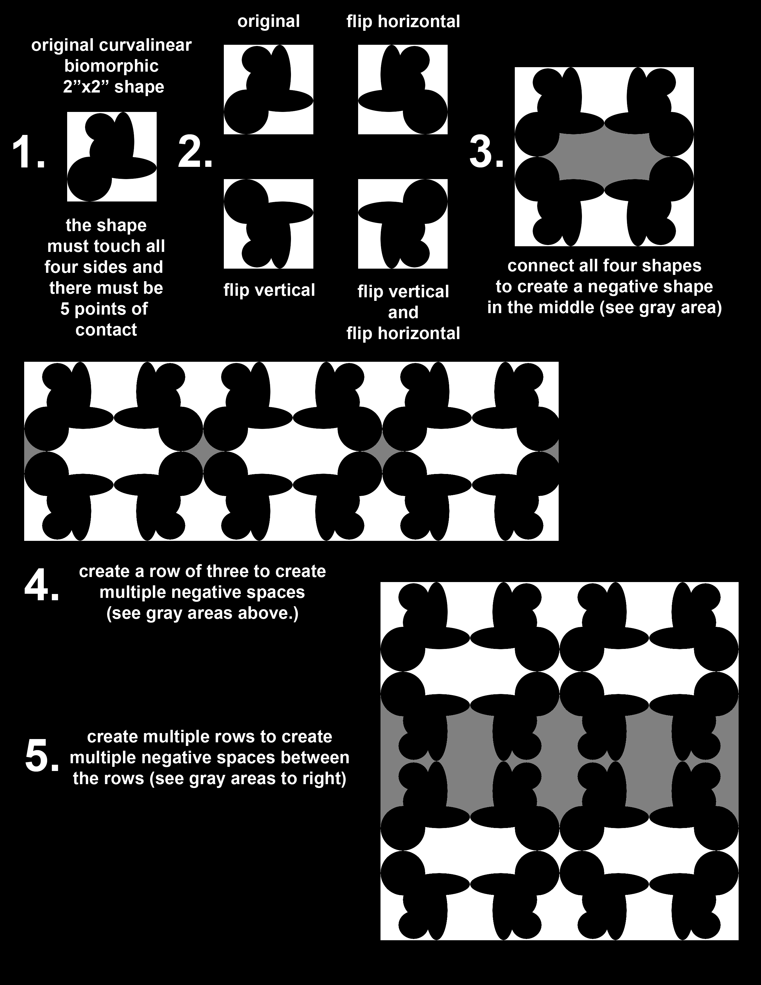
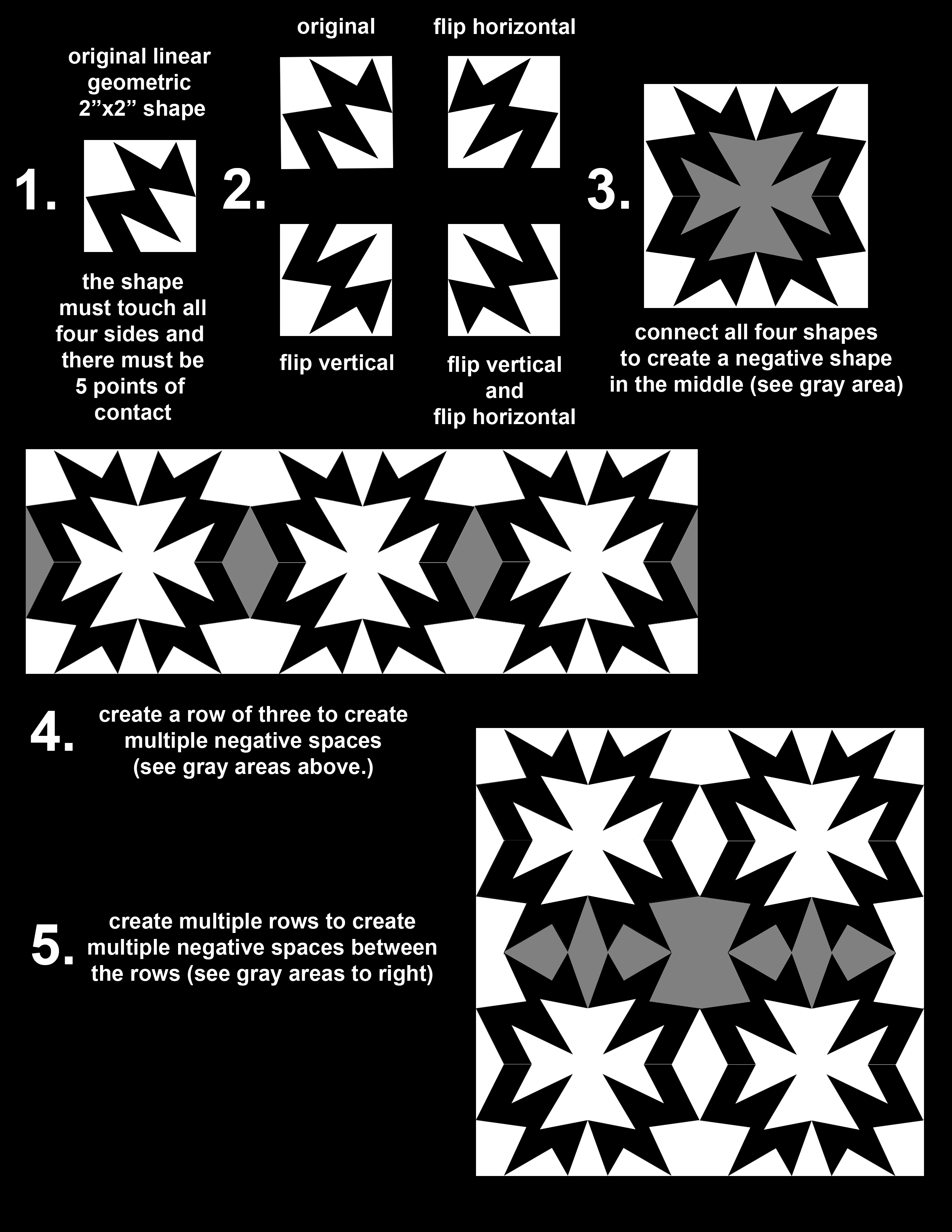
INSTRUCTIONS: Step 1: Create 2 sketches of Original Geometric and Biomorphic shapes.
- Walk around campus and, in your sketchbook, make quick, gestural, contour drawings of objects and negative spaces. Make sure to find rigid, man-made, geometric shapes and free form, organic, biomorphic shapes.
- Upon returning to the studio, tighten up marks and clean the outline of each drawing with a thick bold line.
- Use a pen and fill the interior of each outlined shape.
- On a 14×17” sheet of Bristol Paper center four 4”x4” Squares for sketching.
- Using the your sketches as source material, adjust 2 of your shapes to do the following:
- In one of the square use a ruler or straight edge to draw straight lines that create geometric shapes that fit inside the squares. The shape must touch all four sides of each square and there must be 5 points of contact where the shape meets the edge of the square. Ink and fill in the shapes.
- In the other squares use the circle template and the French curve to draw curvilinear lines to create a biomorphic shape that fit inside the squares. The shape must touch all four sides of each square and there must be 5 points of contact where the shape meets the edge of the square. Ink and fill in the shape.
Step 2: Choose a shape out of the two sketches and create a motif pattern by symmetrically flipping the shape into four quadrants.
- Choose the most effective shape out of the 2 designs and redraw the shape into a 2”x 2” square on your Bristol.
- Cutout the shape (this will be your template to trace onto the black paper.)
- Trace and cut four shapes on the Black paper.
- Arrange the four shapes into a 4”x 4” quadrant. In the top left quadrant fit your first cut out shape. In the top right quadrant, flip the second cut out shape horizontally. In the bottom left quadrant, flip the third cut out shape vertically. In the final bottom right quadrant, flip the shape vertically and horizontally to complete the vertically and horizontally symmetrical shape.
- This design will be the repeating motif in your final layout. Cut out 16 original shapes to create 4 similar quadrant shapes that will be laid out in a grid.
Step 3: Arrange 16 black shapes into the motif, choose a white negative space area in the pattern and cut out the appropriate amount of shapes to fit into the design, and glue down your motif pattern composed of black and white shapes on a Gray 8”x 8” background.
- The final motif will be a 8” x 8” grid (16 shapes) of your original shape; a grid that is also 2 motif quadrants wide and 2 motif quadrants long
- Cut out an 8”x 8” background of gray paper.
- Look at the negative spaces that are created by the connecting design.
- Choose a series of these negative shapes to be white.
- Cut enough of these white shapes to fit into the final repeating/alternating design
Step 4: Asymmetrical composition and painting
- Count the number of white, and gray shapes.
- Draw an 8” x 8” square on a sheet of Bristol.
- Considering contrast and emphasis: Compose the 8” x 8” square using the same number of shapes, adjusting their size and placement as the only variable. This can be done in Adobe Illustrator.
- Using a 4H pencil, carefully draw your composition; be as specific and accurate as possible.
- Using your knowledge of color, choose 3 colors for your composition. Assign the lightest color to the white shapes, the middle value color to the gray shapes, and the darkest color to the negative space. Your colors must be mixed, meaning they can not come straight from the tube.
- Paint your composition.
- Glue down your final motif on a 15”x 20” sheet of smooth illustration board.
- Once dry: Cut out the 8” x 8” design and glue down your painting on a 15”x 20” sheet of smooth illustration board.
Note: A huge part of this assignment is craftsmanship, so be sure your final is as neat as humanly possible—in other words, flawless.
Shape Presentation
Grade Report
| Craftsmanship and Neatness in Motif and Sketches 15 points | |
| Composition in Motif (Arrangement of White Shapes, Creation of Gray Negative Space) 15 points | |
| Following Directions 10 points | |
| Professionalism and Presentation 10 points | |
| Sketches 10 points | |
| Craftsmanship and Neatness in Painting 20 points | |
| Composition in Painting 20 points | |
| Total Points of 100 |
Project 2 Line:
(Rectilinear/Curvilinear & Ruled/Freehand Line)
MATERIALS:
Graphite Pencils Pack of 4 Graphic or Soft Sketching Pencils (HB, 2B, 4B, 6B)
Design Ebony Drawing Pencils Pack of 2
Black Inking Pens 1 Micron .04 pen, 1 Fine Point Sharpie + 1 (2 sided Fine/Broad) Prisma-Color Marker
French curve with inking edge 10 ½ inking edge
Metal Ruler: 18” or 24”
Circle templates with large and small circles up to 2” in diameter
T-square or triangle with 12” inking edge
Sketch Book 8”x10” or 11”x14”
Pad of Bristol Paper 14” x 17” pad
Cartography and Experience.
Walk through a space. Consider how the space changes and how your relationship to the space changes. Is there more or less atmosphere around you; is it a claustrophobic or agoraphobic experience? Is it cold or warm? How much light passes through the space and how high are the ceilings, are you indoors or outside? These things define a physical experience. How can you translate a physical experience into an image using line?
We do this all the time. Think about Google maps. You ask for directions from one place to another and Google translates your request into a linear description of your pending physical travel. Point A to Point B. What if you were to give the traveler more information about their trip? Congestion and traffic maybe defined as a thick, bold, line or in other words a stagnant, slow line. While an area of open road could be a fast and direct passage more clearly defined with a light and thin line. This is an experiential form of cartography: the science, skill, or work of making maps.
What other types of experiences are there? I just described a physical experience, but how else can we experience a space. And how do we define a space? Is there other “spaces” you can be in. We experience things from an individual viewpoint, but that also brings the baggage of our identity in a broader sense. Think about how you can map those types of experiences. How does one travel through a cultural experience, and if asked for directions what would your map look like?
Part One: Sketches:
These drawings can start in your sketchbook but eventually need to be 4”x5” and inked on Bristol.
Make one nonobjective drawing defining a physical experience through line. Vary your use of line and its weight to describe the physical space in different ways.
Make one nonobjective drawing that maps a nonphysical experience. How is that experience defined in a nonobjective visual image? How do you translate the experience into line?
Part Two: Final Design Planning:
A preliminary drawing before the final drawing that helps you figure out what to do in the final. Starts in your sketchbook so that you can resolve issues there.
Once your line drawing is finished, look at different areas that could be interesting negative spaces. Think of how these spaces could be hatched to push certain elements of the drawing forward in the picture plane and some elements back.
Maintaining the “map” is less important than making a solid design. The map is just a starting point, don’t become too tied to the reference material.
Part Three: The Final Design:
When you think you’ve got it figured out, make an 8”x10” design on a new sheet of Bristol. Start your drawing by lightly sketching with a 4H pencil. Do not press too hard as you will damage the paper. Neatly ink over your design, and erase all pencil marks. Your design should be centered on the page.
Remember to think about all the elements of your design as compositional elements. The border is a compositional element. How does it relate to your drawing? What is its shape? Is it necessary?
Objective to Non-objective & Line Presentation
Grade Report
| Clear understanding of non-objectivity as well as a line based design10 points | |
| Use of line variation and line quality15 points | |
| Craftsmanship and Neatness15 points | |
| Activation of negative space. Understanding the figure/ground relationship.15 points | |
| Composition15 points | |
| Following Directions10 points | |
| Professionalism and Presentation 10 points | |
| Sketches10 points | |
| Total Points of 100 |
Project 1: COLOR
MATERIALS (You will Provide):
- Paint Brushes
- Acrylic Paints (Mars or Ivory Black, Titanium White, Cadmium Red, Cobalt or Ultramarine or Cerrulean Blue, and Cadmium Yellow. Specific colors we discussed at the beginning of the semester. Optional Dioxazine Purple)
- Disposable Palette
- Small Glass Jar
- 2 Illustration boards (Hot Press) Comes in a pack of 2 (15”x20”) or 1 (20”x 30”-can be cut into 2 pieces)
- Rubber Cement or Glue Stick
- Scissors and Exacto Knife
- Circle Template
- Ruler
- Graphite Pencils
- Carbon Transfer Paper
- Bristol for swatches.
Sketches:
INSTRUCTIONS:
First, Measure and Split your illustration board vertically so you have 2 10”tall x 15”wide sections (divide with light graphite line):
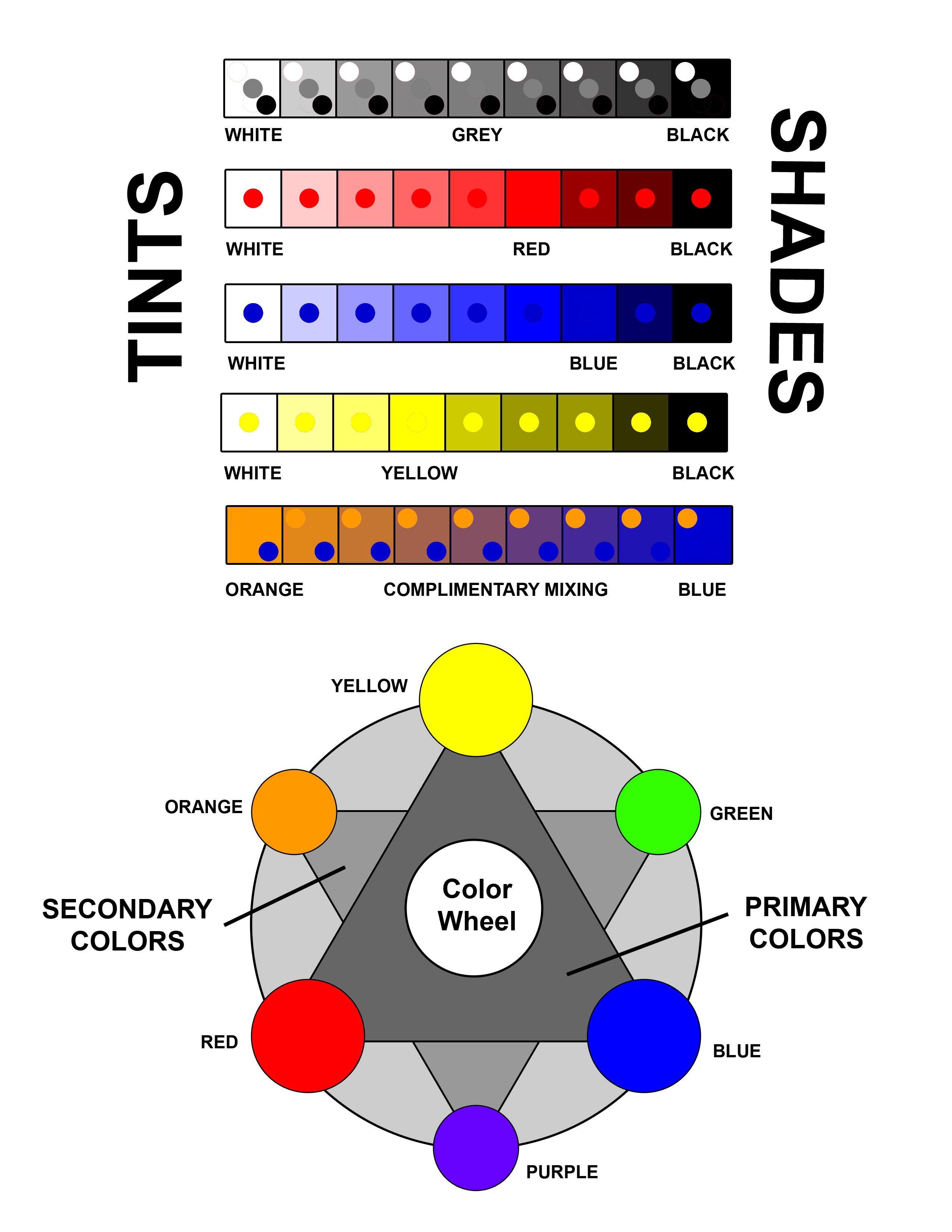
Next, you will be making 5 (1” tall x 9” wide) horizontal strips broken down into 1 “ square increments. (see diagram)
The first row will be nine steps of grayscale value.
(white to black)
The next three rows will show steps of tints and shades with primary colors.
(white – primary – black)
And the last row will show one complimentary mixture.
(i.e. blue-orange, red-green…)
Using the acrylic paints on Bristol paper go through the following steps:
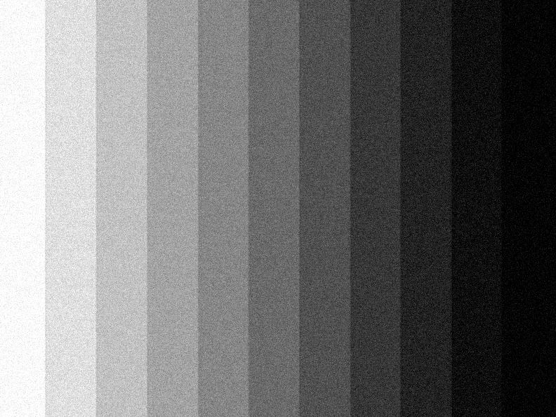
1. Grayscale:
Starting with pure white, slowly add small equal increments of black to make steps of subtle gradation until you reach pure black.
- Primary tints and shades: (3 different sets Red, Yellow, and Blue)
Start by making a 4” swatch of the primary color you will be using first without any mixing, this will be your pure swatch of local color.
Next, begining with pure white, slowly add small equal increments of a primary color to make steps of subtle gradation until you reach pure local color, at this point begin adding small equal increments of black until you reach pure black.
Finally, continue the same procedures for the other 2 primaries.
- Complimentary Mixture:
Start by mixing equal amounts of the three different possible pairings of primary colors (Red with Blue, Blue with Yellow, and Red with Yellow). Now make a 2 inch swatch of each of the results. You should get a second set of colors, we will obviously call these secondary colors, which are (Orange, Green, and Violet (Purple)).
Next, choose one complimentary pair (Red/Green, Blue/Orange, Yellow/Violet) and You will begin by starting with one of the secondary colors and you will slowly add small equal increments of the complimentary primary color to make steps of subtle gradation until you get back to pure local color.
- Drying and Arranging:
Let your paints dry completely on the drying racks and resume cutting out your color swatches. In the meantime you can start laying out your illustration board. Follow the directions on the following diagram and lightly center and sketch in where you paste in your cut out swatches. Remember to always start measuring from the center so your borders are of equal spacing.
You can also think about incorporating text to label the diagram. Try your best to make it neat, legible and interesting. Start lightly in graphite and finish by inking your final text in.
REMEMBER: Your color wheel will includes the primary, secondary, and tertiary colors. The tertiary colors are not in the diagram, but are required.
Final Draft:
INSTRUCTIONS:
Start by taking your B+W photographic portrait and a sheet of carbon paper and transfer the main linear structure of your image on the Bristol. Your painting should be 8″ x 10″
Next, you will make one of four paintings. Using your self-portrait you will explore one of the Colors Schemes: monochromatic, analogous, complimentary, and a final one that is more realistic or natural in color.
- MONOCHROMATIC
First, you will choose one primary or secondary color as the basis for the first painting.. Next you will paint your monochromatic portrait by starting at white and working your way to black (note: the photo is already reduced into distinctive shapes of value.) You will use tints (white added) and shades (black added) to make your monochromatic variations until you have a full value scale of one color. - ANALAGOUS
Second, you will choose an analogous color scheme of 3 colors (colors next to each other on the color wheel) to paint your next portrait. I want you to choose a scheme that is either warm or cold in its feeling and association. With the three different colors, paint the back ground one color with varying tints and shades. Paint the head and hair one color with varying tints and shades. And paint the clothing one color with varying tints and shades. Alternatively identify the lightest of the three analogous colors and use that as your “white,” use the darkest as your “black,” and the middle value as your “middle gray.” So If you were to use Yellow, Orange, and Red. All of the values that you see as white would be painted pure hue yellow, anything darker that white but lighter than middle gray would be a variation of yellow orange. Anything middle gray would be orange, and darker than middle gray but lighter than black would be a variation of red orange. All of your blacks would be red. - COMPLEMENTARY
Third, you will choose two different complementary color sets to paint the next painting (colors opposite each other on the color wheel). Choose one complementary set for the Hair and the Clothing and choose a different complementary set for the face and background. Alternatively identify the lightest of the two colors and use that as your “white,” use the darkest as your “black.” So If you were to use Orange and Blue. All of the values that you see as white would be painted pure hue orange, and any value you see as black would be painted blue. All of you grays would be variations of the neutralized oranges working to blue. - NATURAL OR REALISTIC COLOR
Last, you will attempt to paint your portrait to have a natural or a realistic look (you will have a little more freedom to mix color on this one). With what you have learned about mixing paint and color, do your best to mix colors that represent natural tones including skin and hair color. Remember to not get too muddy or neutral with your tones and variations and try to keep a full range of values between white and black. Use the background and clothing areas as possibilities for some more colorful and saturated gradations in the image.
Color Presentation
Project 5: Color
Grade Report
| Accurate interpretation of Color 15 | |
| Accurate translation from image 15 | |
| Range of contrast 15 | |
| Craftsmanship and Neatness 15 | |
| Following Directions 10 | |
| Professionalism and Presentation 10 | |
| Sketches 20 (Accurate placement, even steps of value, craft, neatness) | |
| Total Points of 100 |
